WeWork
A Franklyn project in collaboration with A+
A Franklyn project in collaboration with A+
Now more than ever before, we’re questioning where, how and why we work. Over the course of the last decade, WeWork has dominated the coworking industry, expanding from its roots in New York City to hundreds of locations worldwide. However, following the departure of its controversial founder, WeWork faced both an identity crisis and the challenges of a pandemic-altered office landscape. Seeking to shed the past and redefine their brand, WeWork turned to Franklyn.
Together, we reimagined their strategy and visual identity, emphasizing the power of individual decision-making and showcasing WeWork as a caring platform for its members. With a layered illustration system, a redesigned wordmark, and a custom typeface, we crafted a sophisticated and warm brand that honors WeWork’s history while propelling them forward as industry leaders.
Story Continues ︎︎︎
Inspired by the wordmark, a custom typeface was developed in partnership with A+. “WeWork Serif” echoes the charm of the refreshed wordmark and was designed to play nice with the brand’s existing typeface, Aperçu Pro.


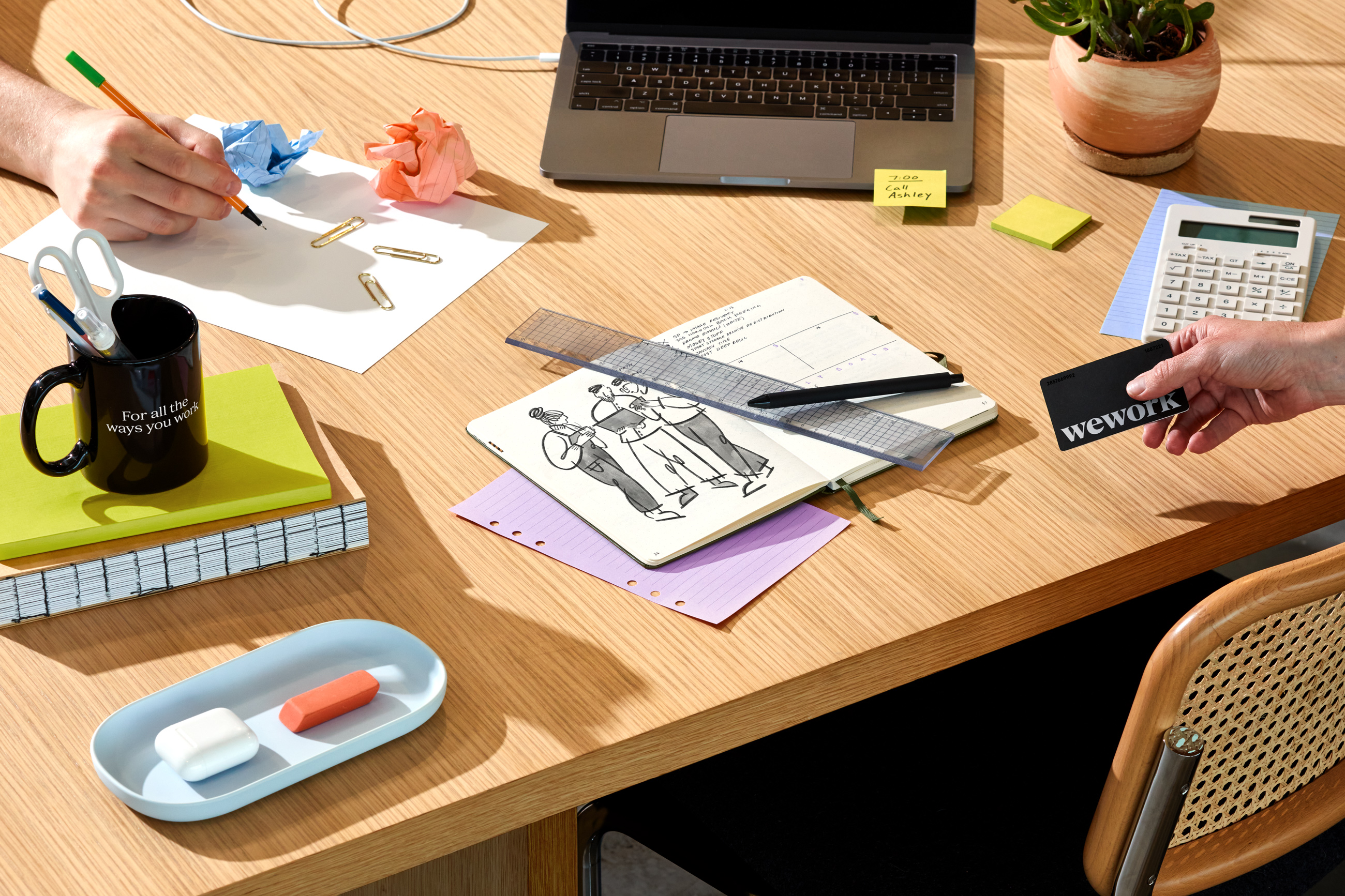
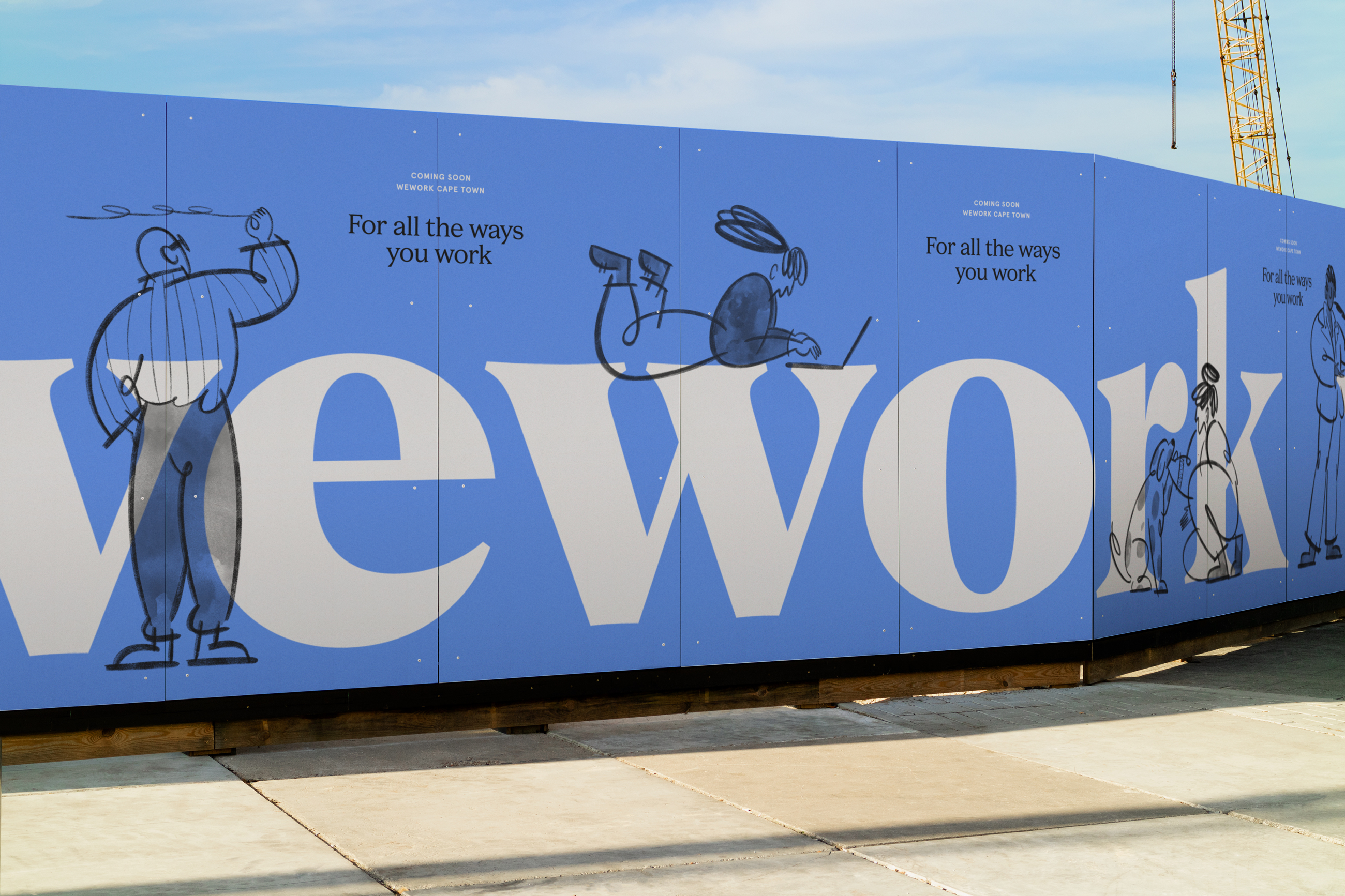
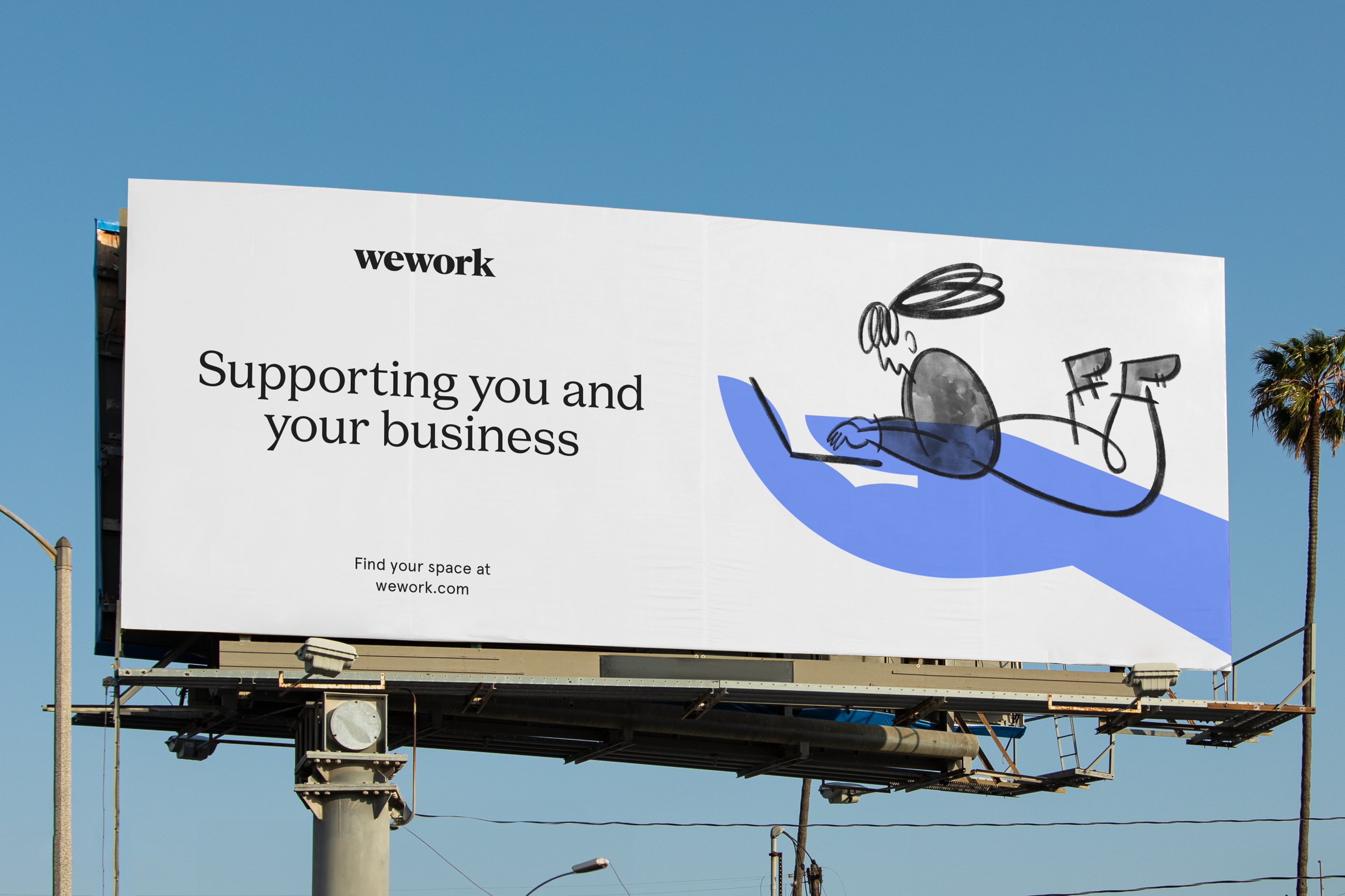
The illustration system visualizes WeWork as a platform for you. A layered system brings together two elements: a set of modern symbols (representing “we”) and a library of doodle-like illustrations (representing the members or “you”).
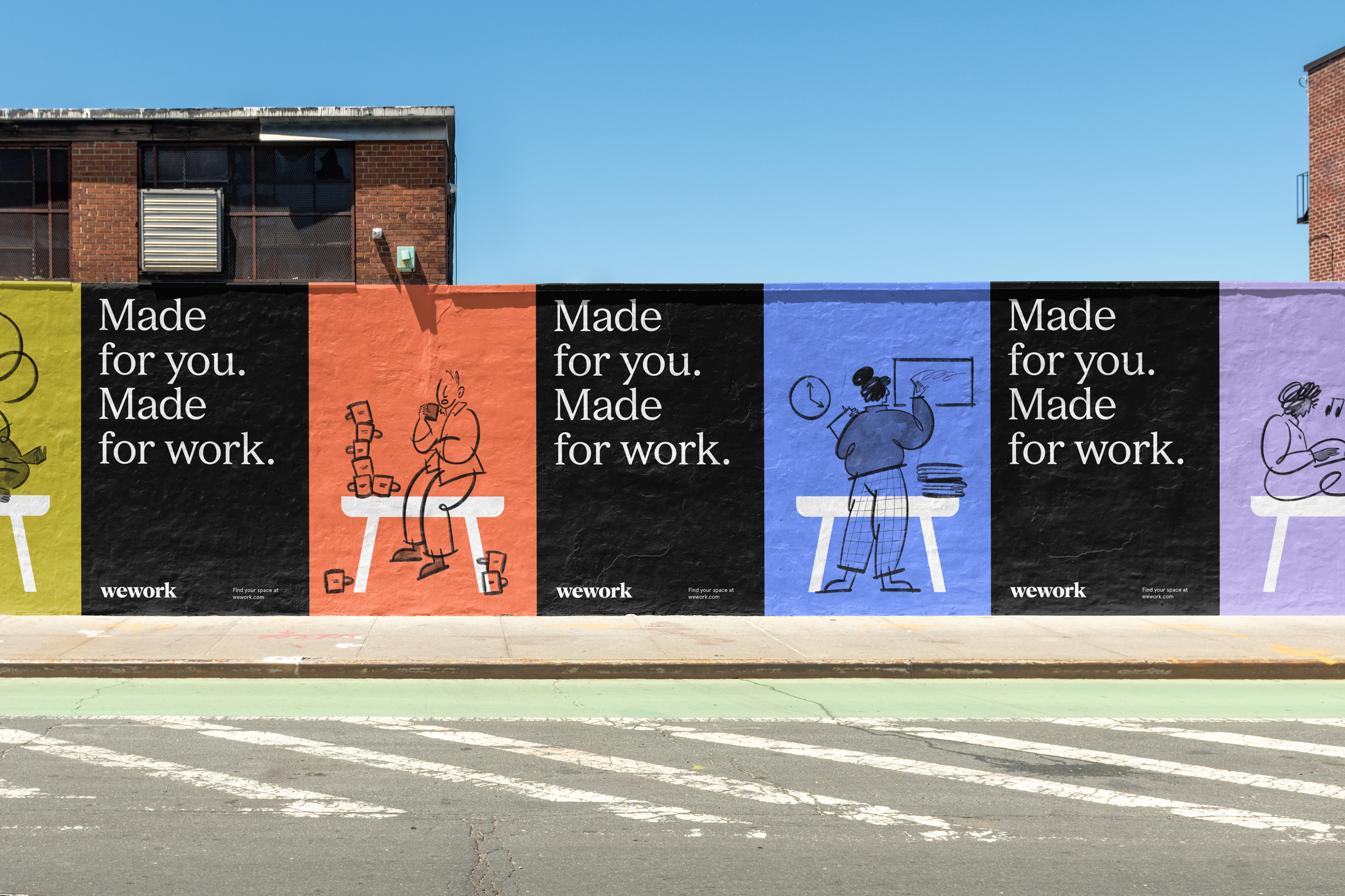


The final result is a system with many possible expressions. From restrained to exuberant, the tools provided by the identity allow WeWork’s in-house designers as well as community managers worldwide to express the brand in a suitable way.


Agency: Franklyn
Creative Direction: Jelle Maréchal
Design: Tess Havas, Gabriel Ribes, Jelle Maréchal
Illustration: Tess Havas
Typography: Graham Bradley (A+)
Strategy: Angie Shih, Eve Wallack
Account Management: Eric Brown, Patrick Richardson
Case Photography: Kendall Mills
WeWork Team: Yoko Kristiansen, David Corpuz, Michael Fitzsimmons, Brenna Stevens, Lauren Fritts, Alexandra Johnston