
London Public Library
A Bruce Mau Design project
A Bruce Mau Design project
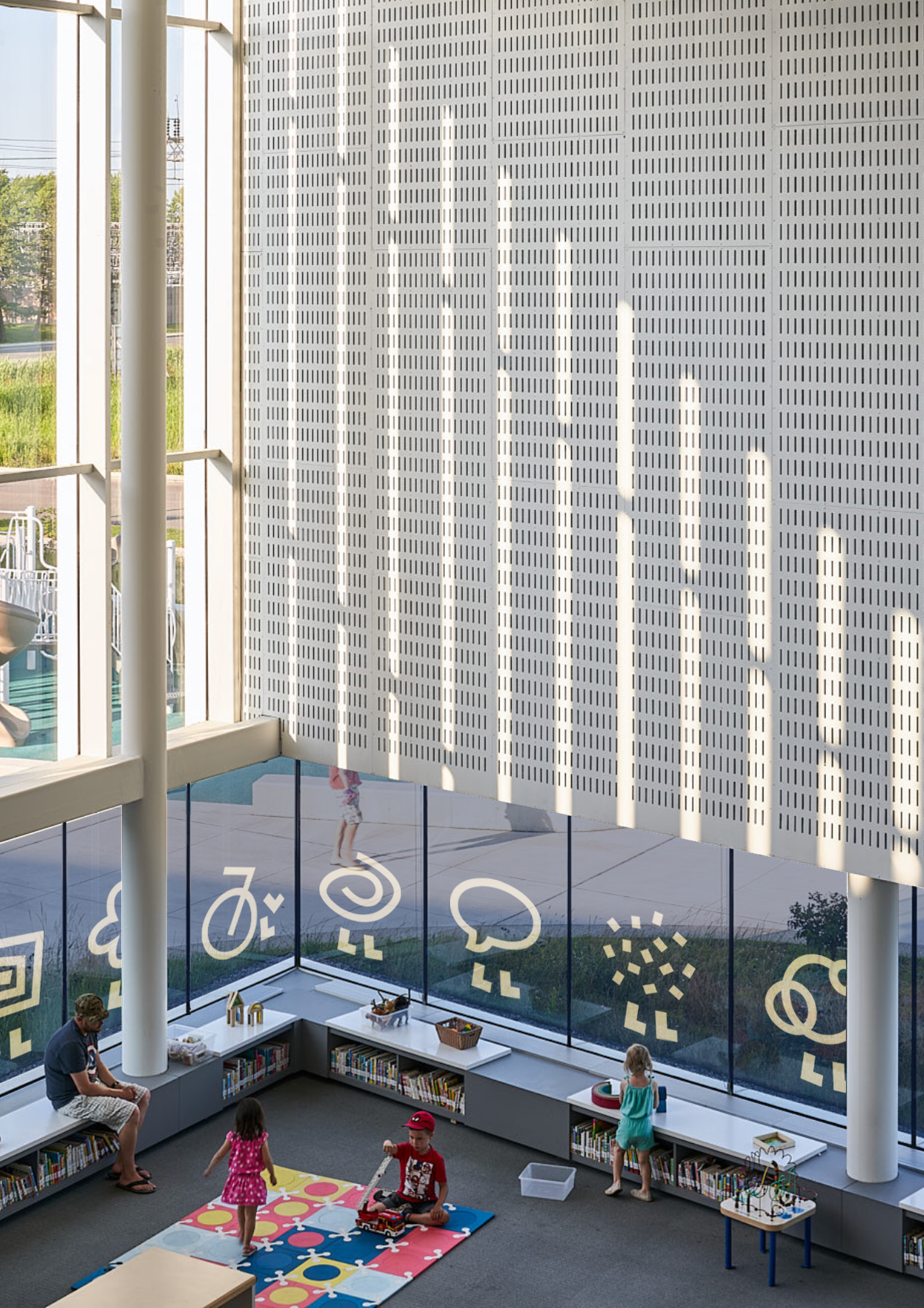
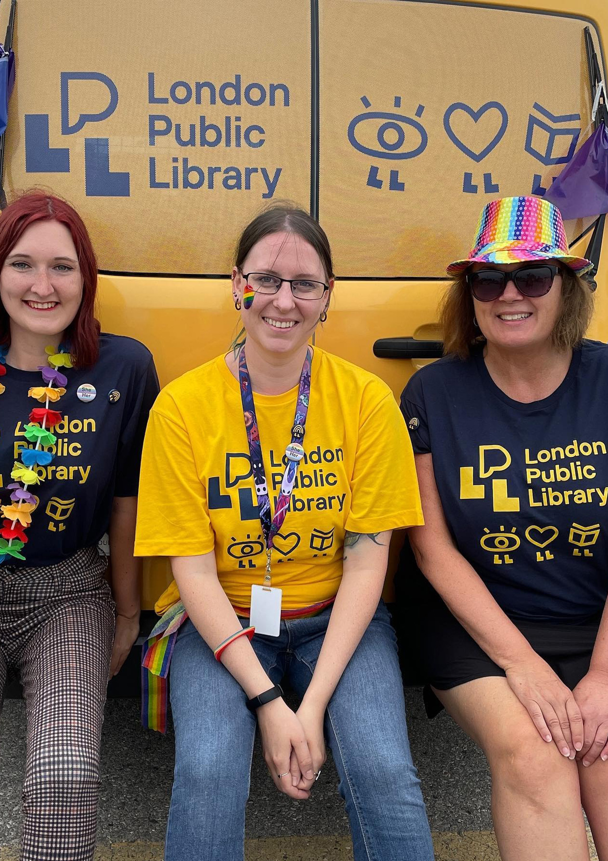
Libraries are a critical part of communities, providing the social infrastructure that benefits new mothers, newcomers, seniors, young children, teens and everyone in between. The London Public Library’s role is no different, certainly a place for books and reading, but more and more the go-to destination for diverse community programming.
Story Continues ︎︎︎
Story Continues ︎︎︎
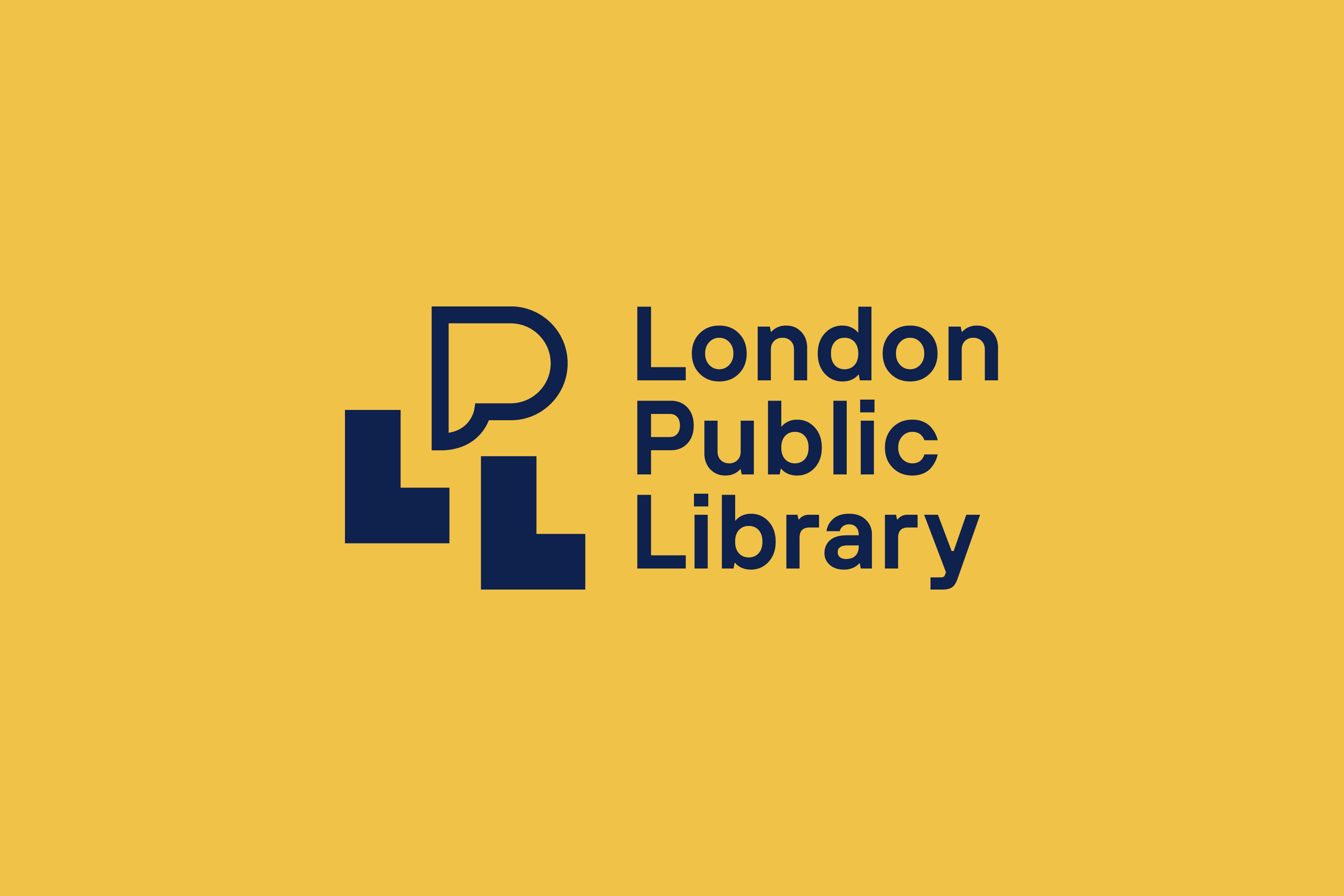
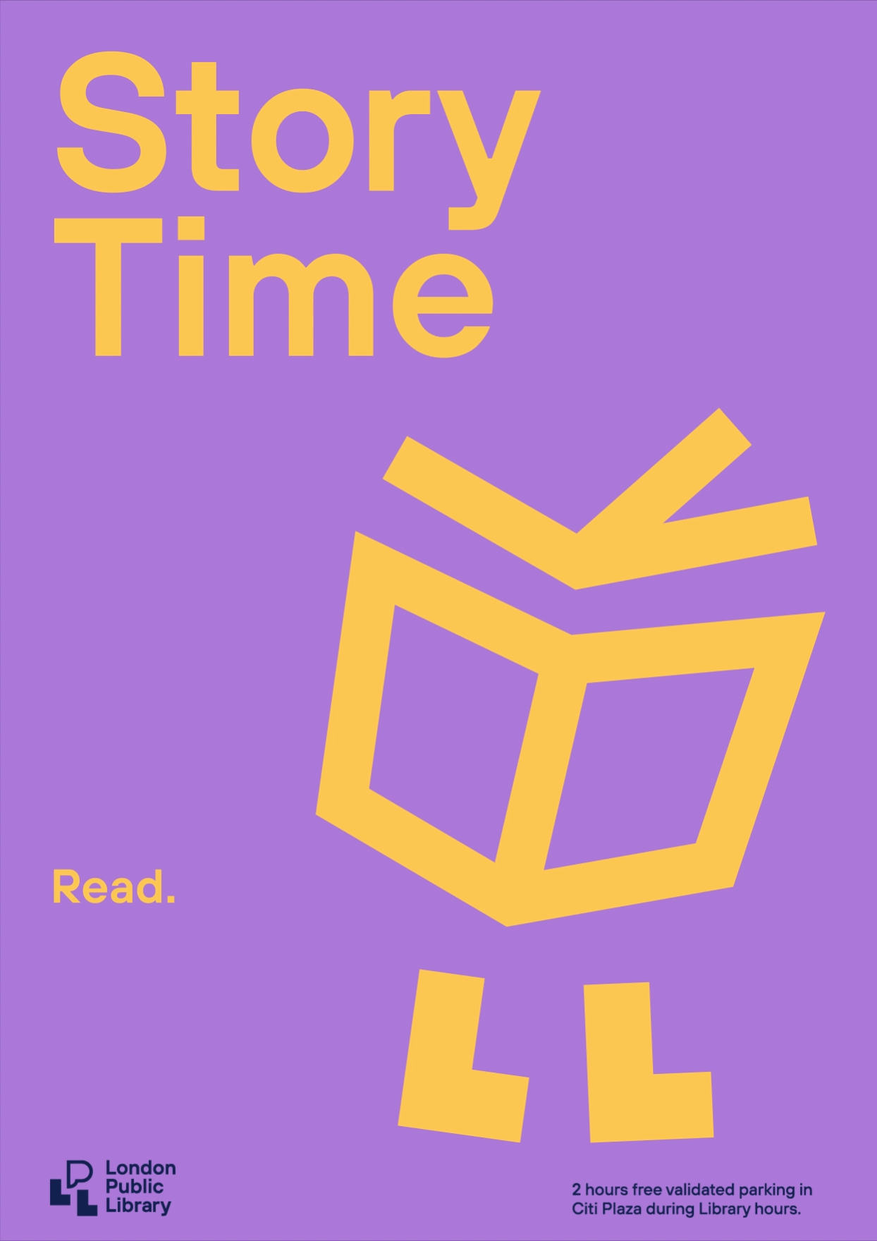
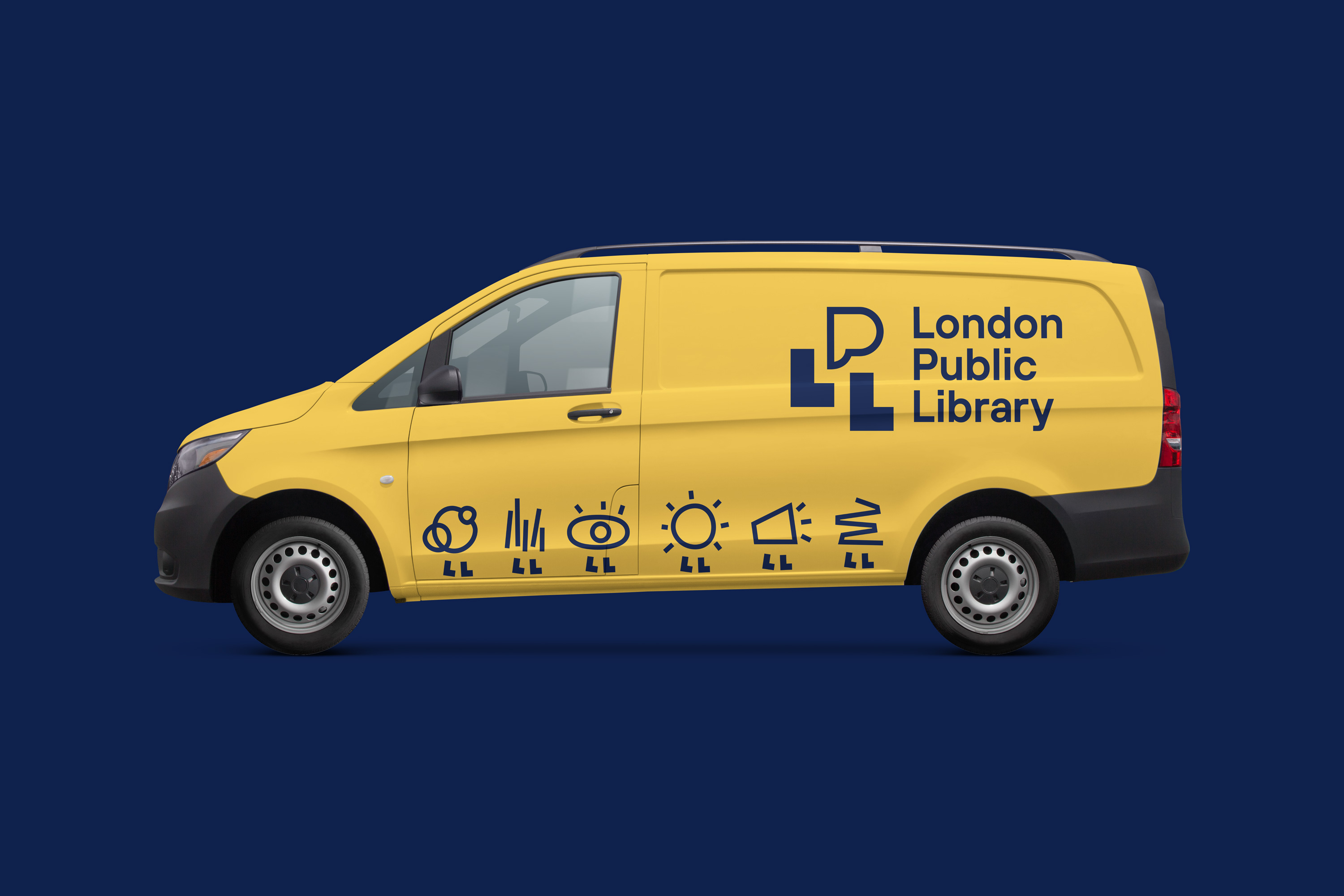
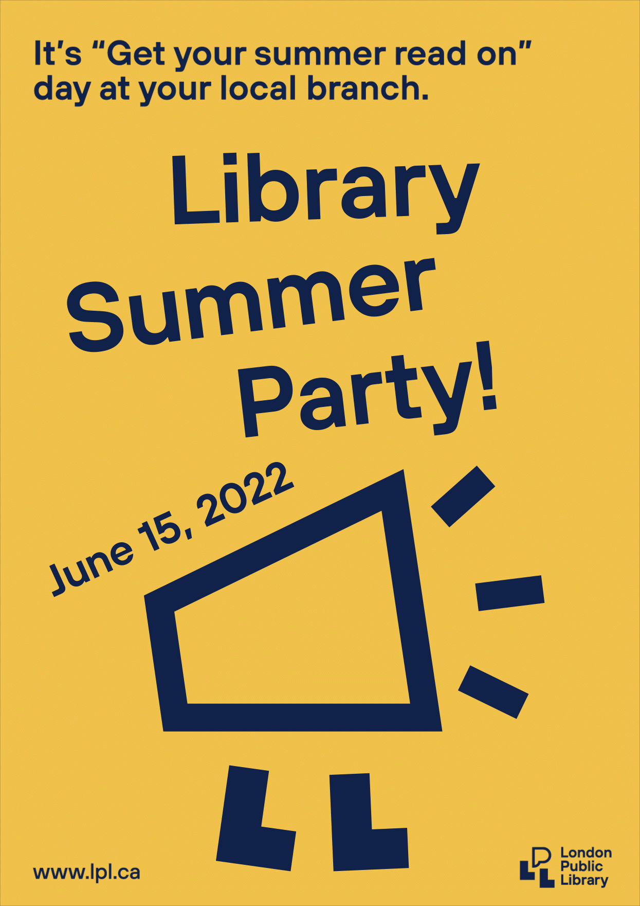
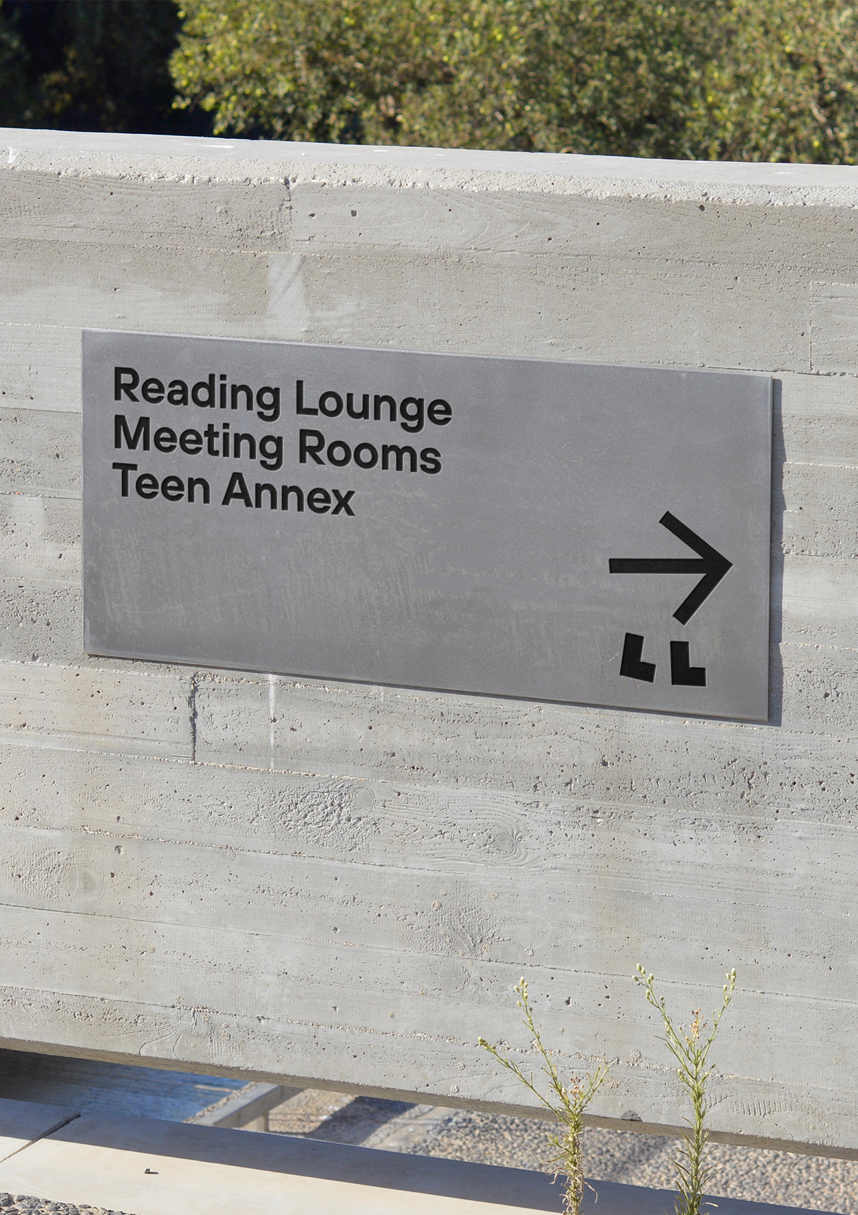
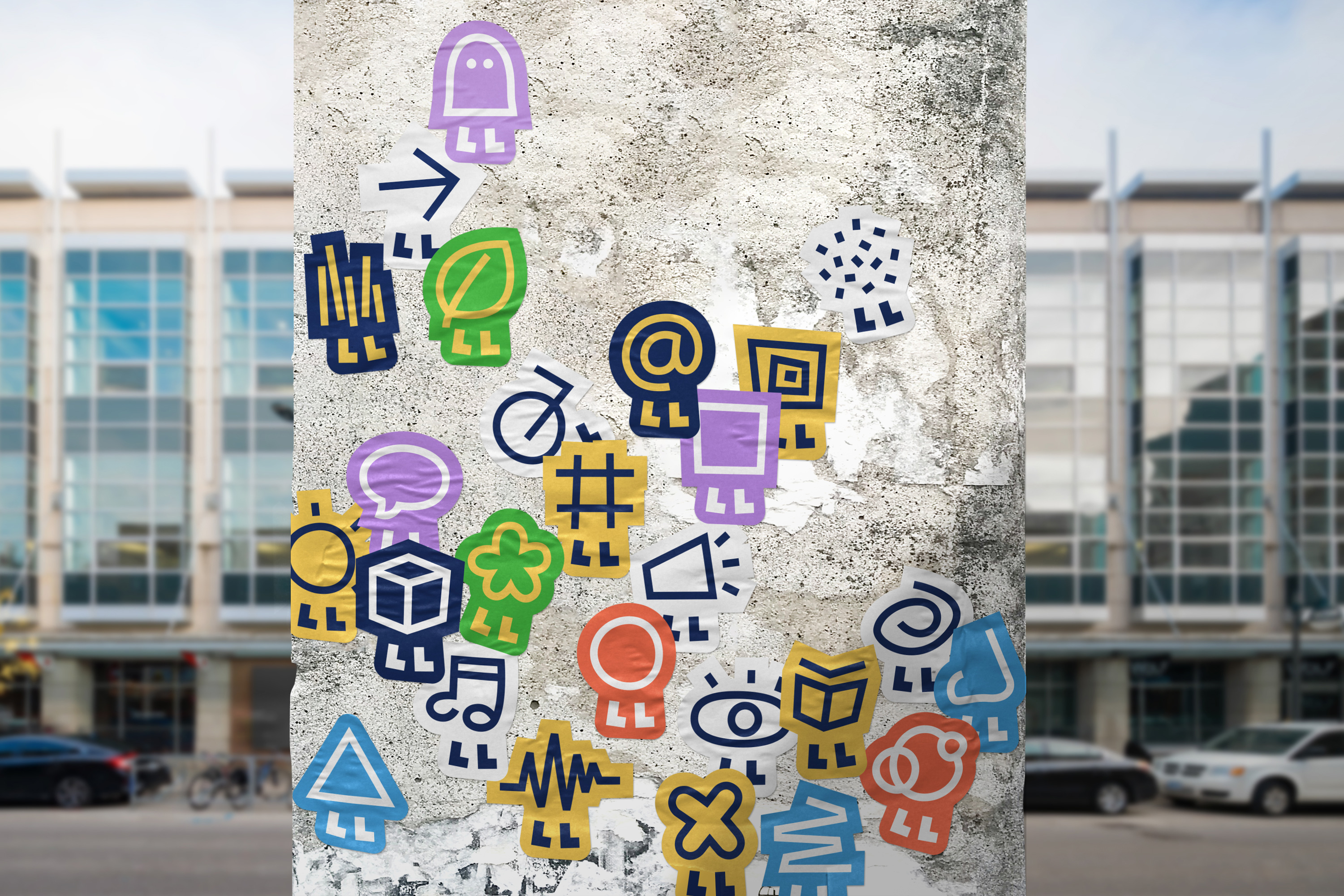
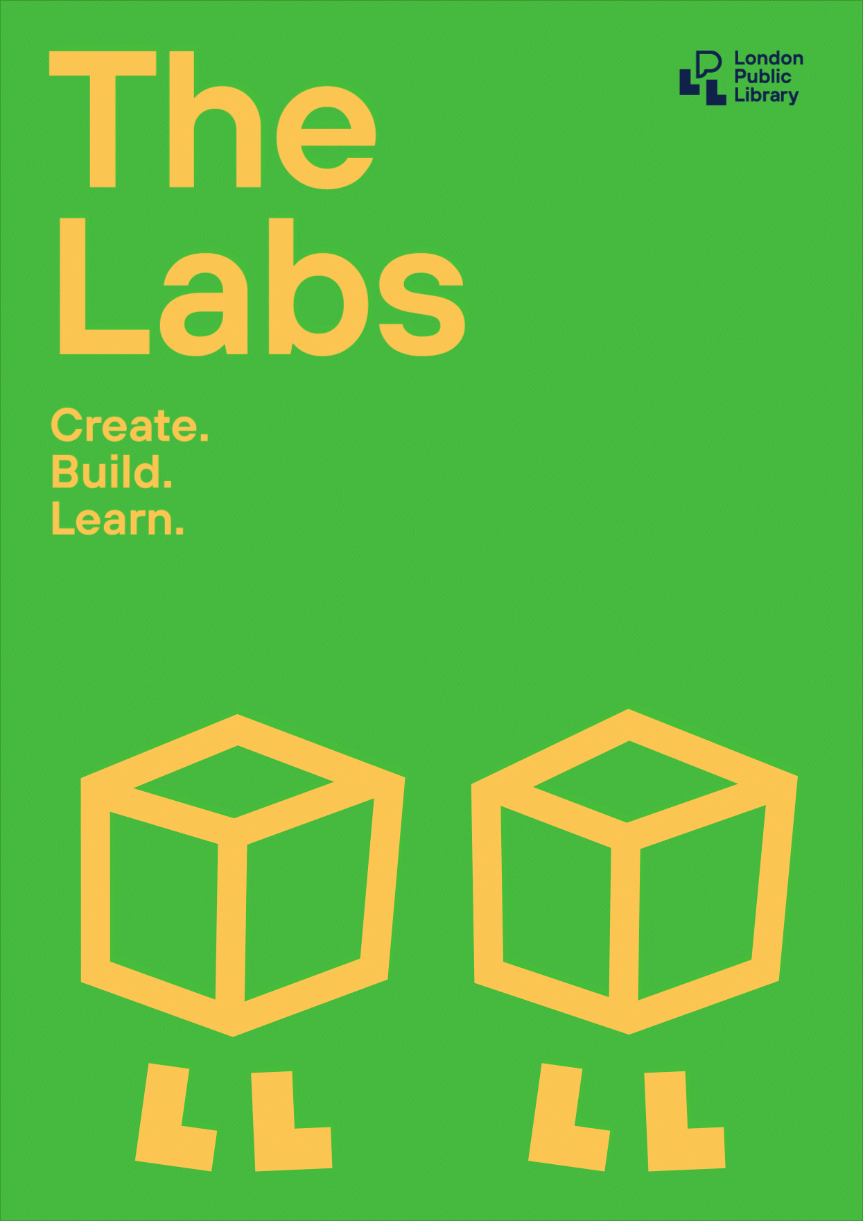
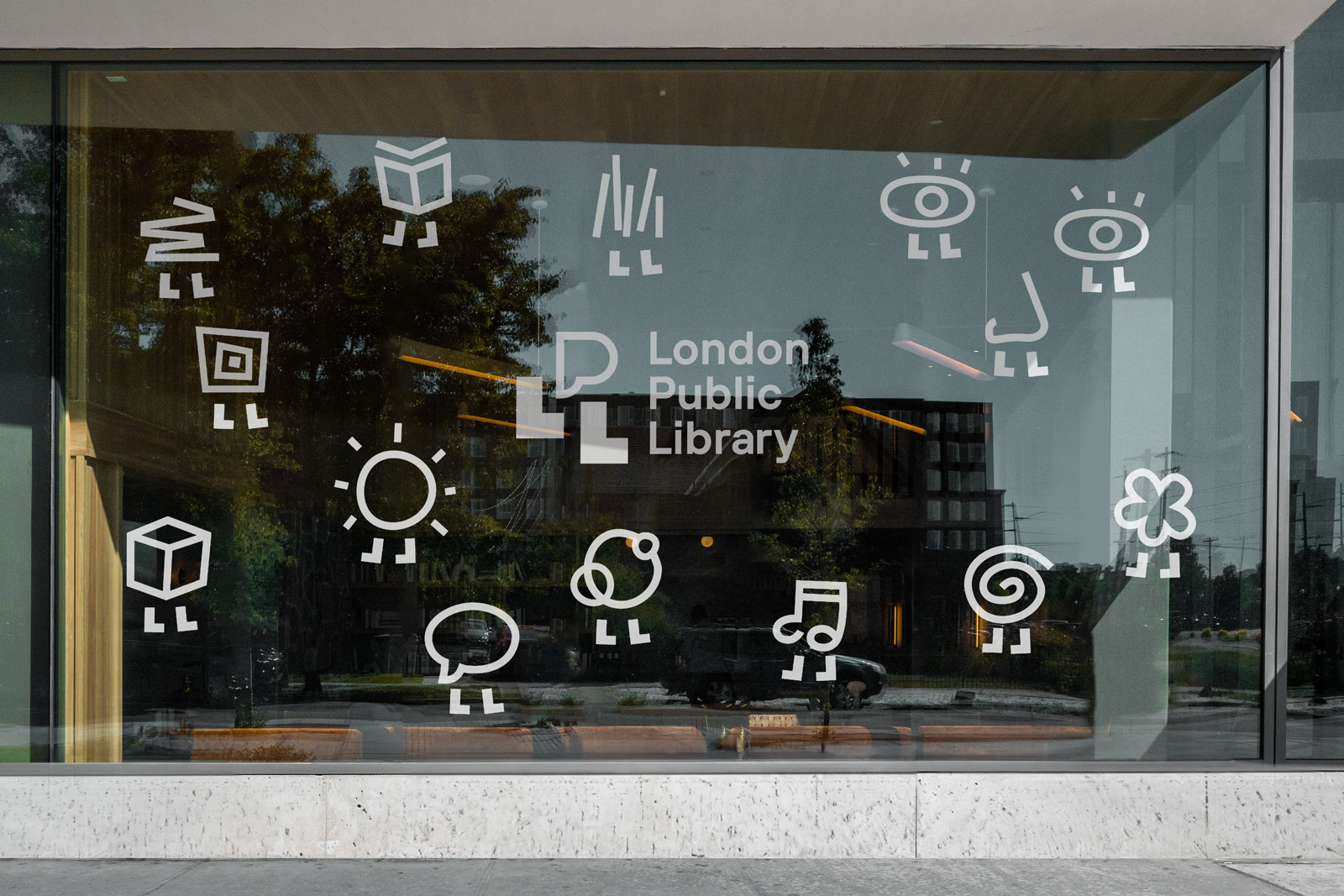
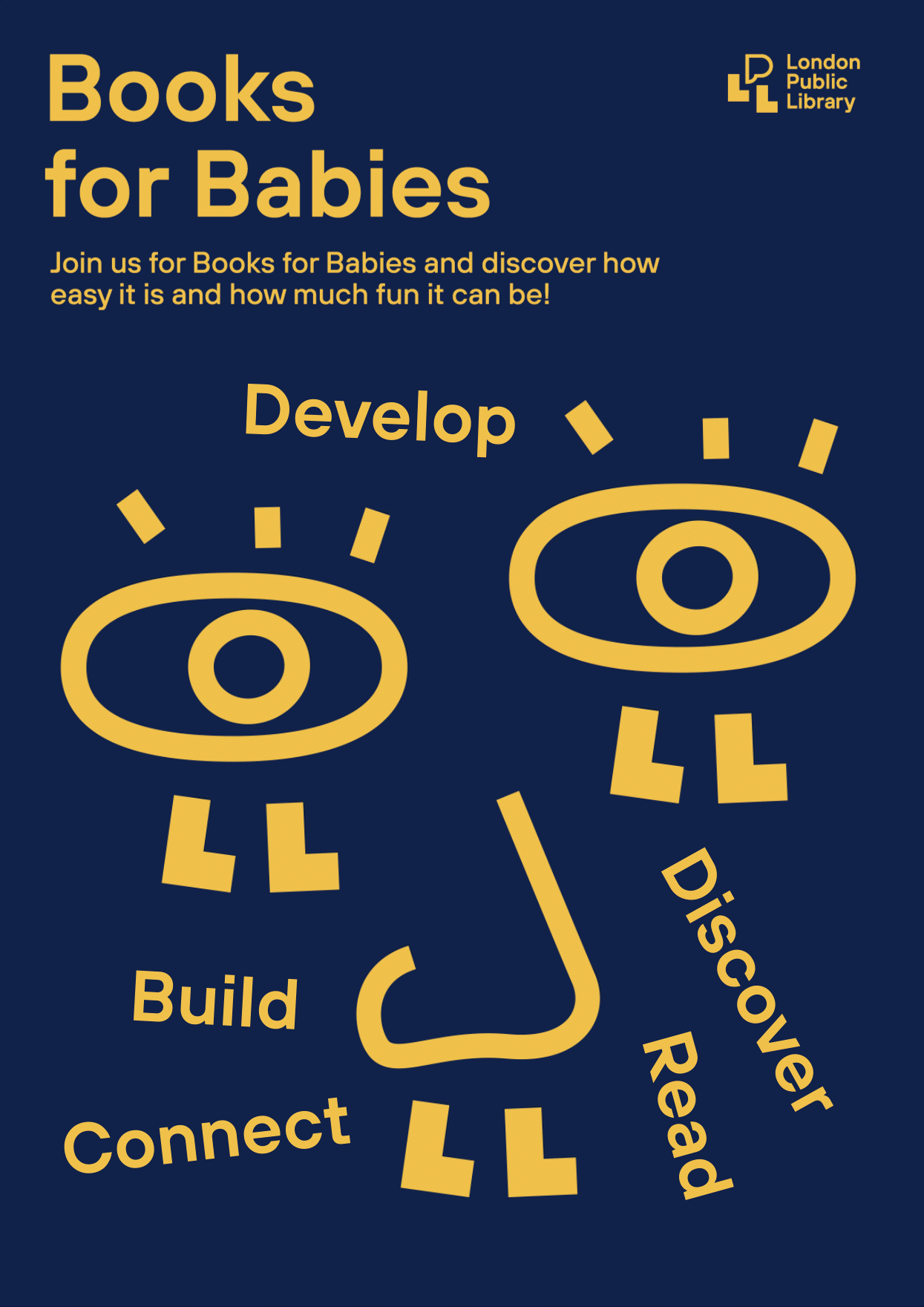
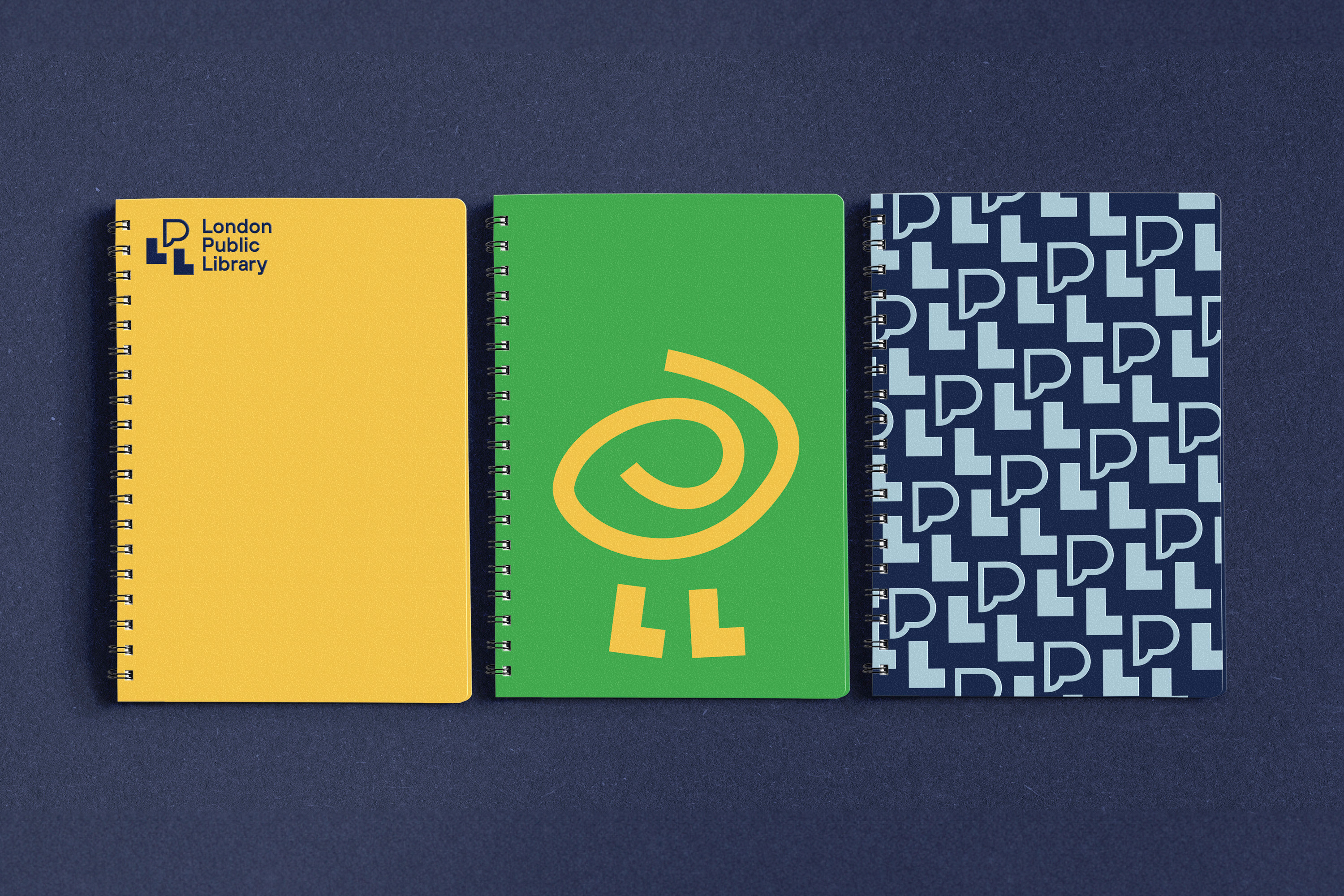
BMD created a flexible identity that celebrates this notion with a playful and engaging dynamic logo. The two “L”s in the shortform (LPL) do double duty as a set of legs, carrying the “P”, drawn as a speech bubble to emphasize dialogue and community engagement. The ‘P’ can change form, creating a variety of anthropomorphic characters that can represent the many aspects of the LPL in a light and lively way.


The system is simple and easy to use, and the Library can create more illustrations as they create new programming. These plug-and-play assets are perfect for an organization with a small marketing budget but a big ambition to welcome everyone.
“This new identity brought light and joy to our team. It’s like a beacon, lighting our new way.” – Ellen Hobin, Communications Manager

Agency: Bruce Mau Design
CCO: Laura Stein
Creative Direction: Jelle Maréchal
Design: Amelie Lorente, Wuqi Liu
Strategy: Kar Yan Cheung, Daphne Chan
Account Management: Patricia Marcucci, Simon Fernandes